


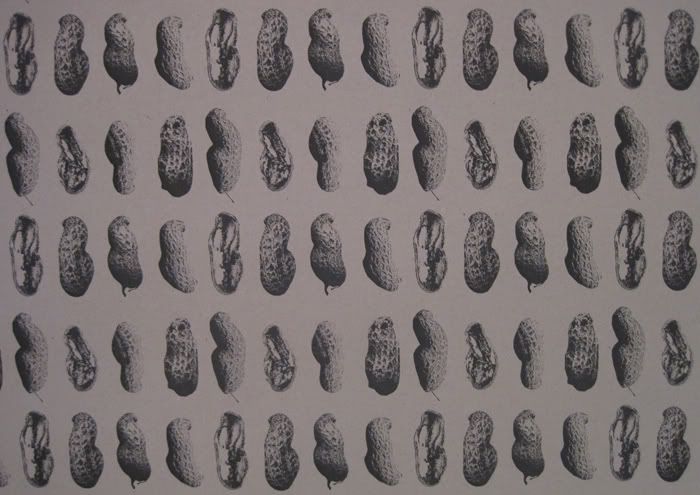
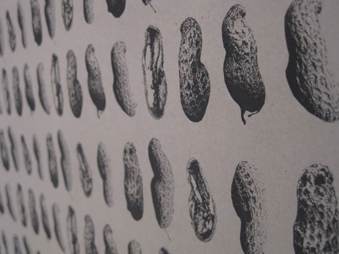
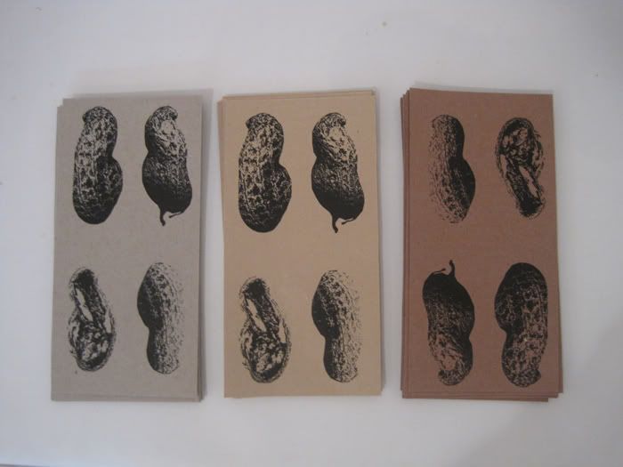
Jo Hosker, a recent graduate from Edinburgh College of Art designed this wrapping paper with a repeated pattern of a monkey nut shell. The shell of the nut has the same role as wrapping paper: it hides the surprise inside.
www.johosker.com
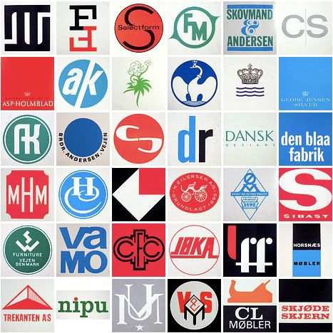

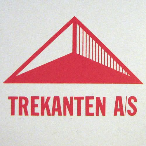
A collection of Danish furniture and textile firm design logos/logotypes from 1960 to 1970.
See more here.
Tamsyn Mystkowki, a 1ina100 artist, has recently be looking closely at "Le Gun" an art collected magazine established by graduates from Londons Royal College of Arts department of Communication Art and Design. It consists of short stories and illustrations.
Above are examples from Issue Number 1. Other issues available here.
www.caleboweneveritt.com/
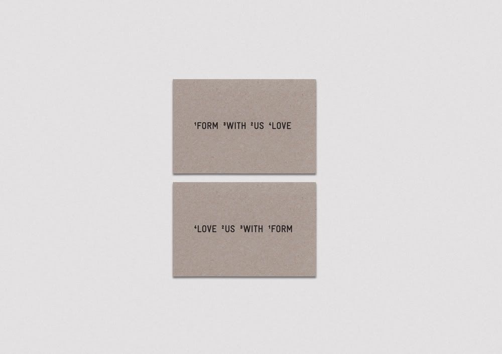
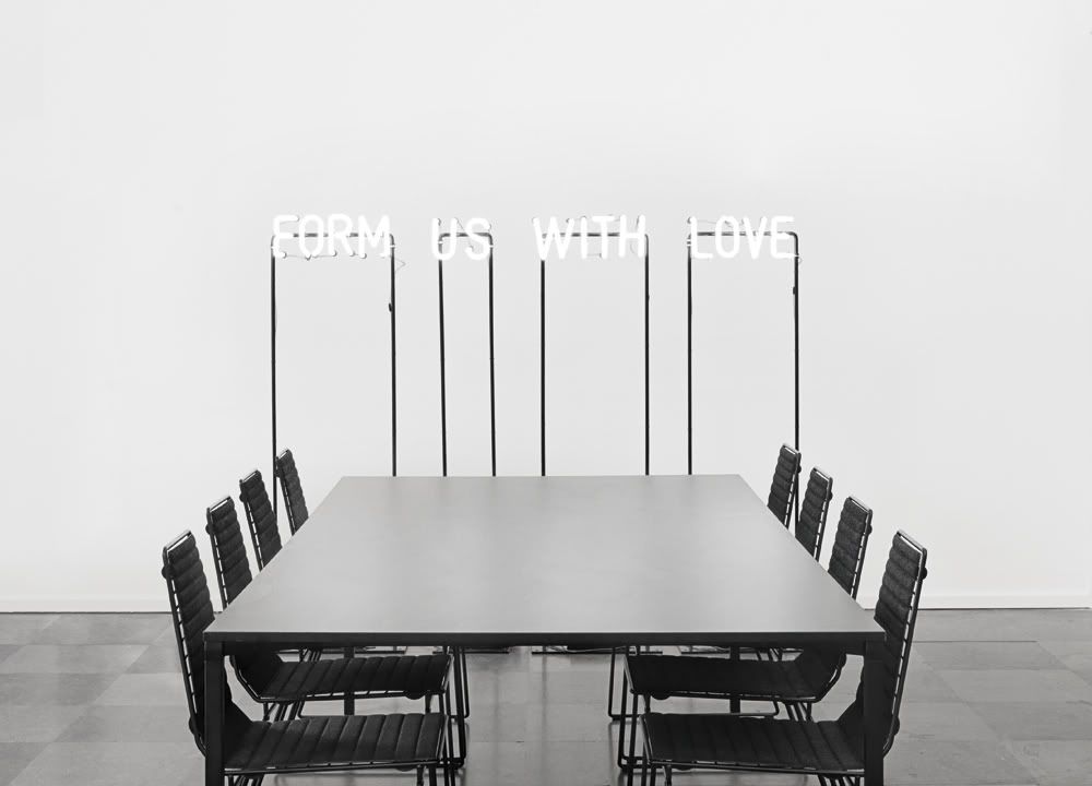
FUWL (Form Us With Love) — Identity
Form Us With Love is a studio in Stockholm that focus on product design and interior architecture. Their new identity is based the words that make up the logo. They are continuously shuffled to generate new solutions, like the studio itself as it generates new ideas every day.
For the neon sign, each word making up the name was put on an induvidual steel frame with wheels, making it possible to change their position.
www.formuswithlove.se
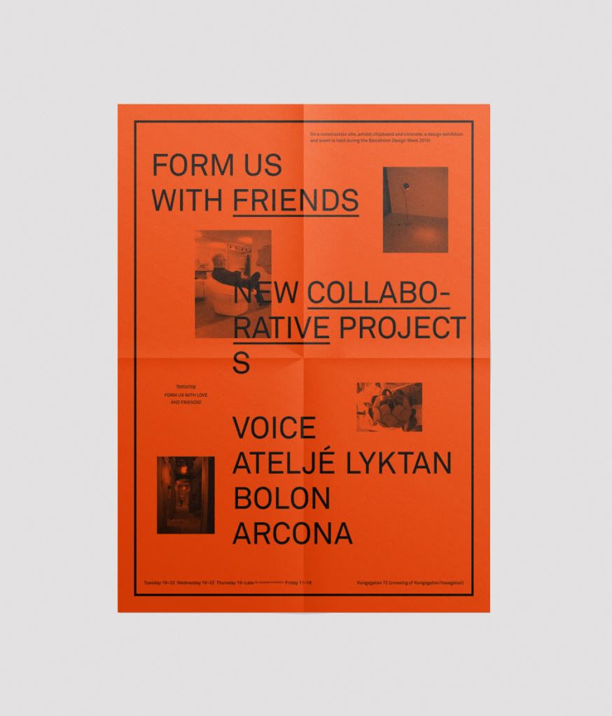
Form Us With Love arranged an exhibition and party in an old building undergoing renovation in central Stockholm. There was broken concrete, chipboard and cables everywhere. The poster and invitation was designed with inspiration from the colors and materials of this construction site.
www.simonrenstrom.se
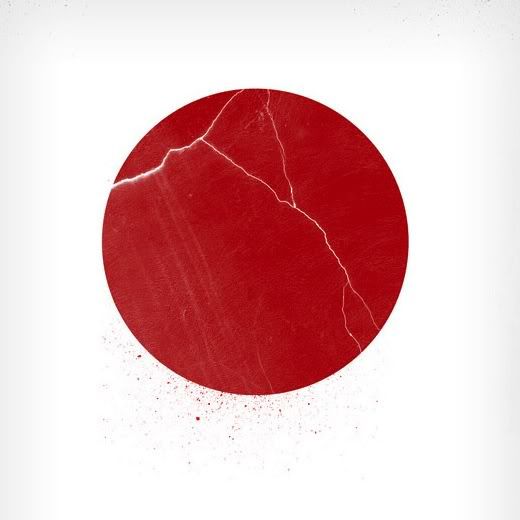
Help Japan by James White.
A print by James White. All the money raised has been donated to charities supporting the recent earthquake in Japan.
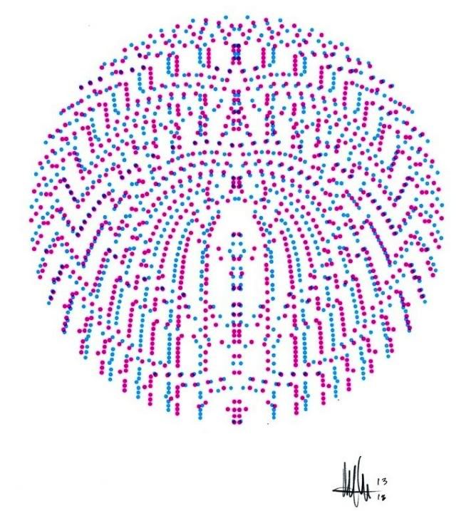
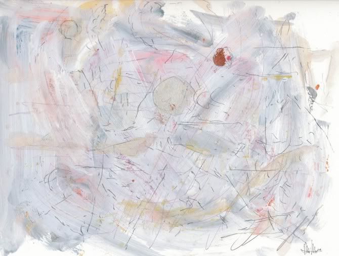
Michael Cina is an internationally recognized Creative Director who is currently leading a multi-disciplinary design studio, Cina Associates. His unconventional approaches to the discipline have a fresh and unique flair varying from typography, branding, illustration, music, photography, art motion and web.
http://cargocollective.com/michaelcinaart
Freddy Taylor, one of our designers has revealed what he is currently looking at;
Grandpeople are a Scandinavian design company specializing in ideas, visual communication, illustration and photography. They have a real eye for colour, typography and art direction.
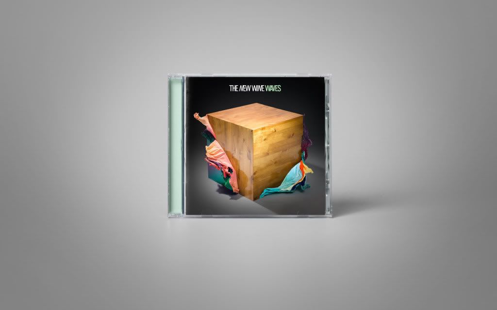
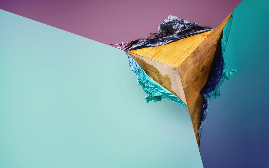
The New Wine – Waves
Grandpeople have designed this CD cover for the debut album “Waves” by The New Wine. The wood resembles the bands move to a darker more organic sound while the PVC film is representative of the band’s truer catchy pop vibe as well as, of course “Waves”.
A concept incredibly well executed.
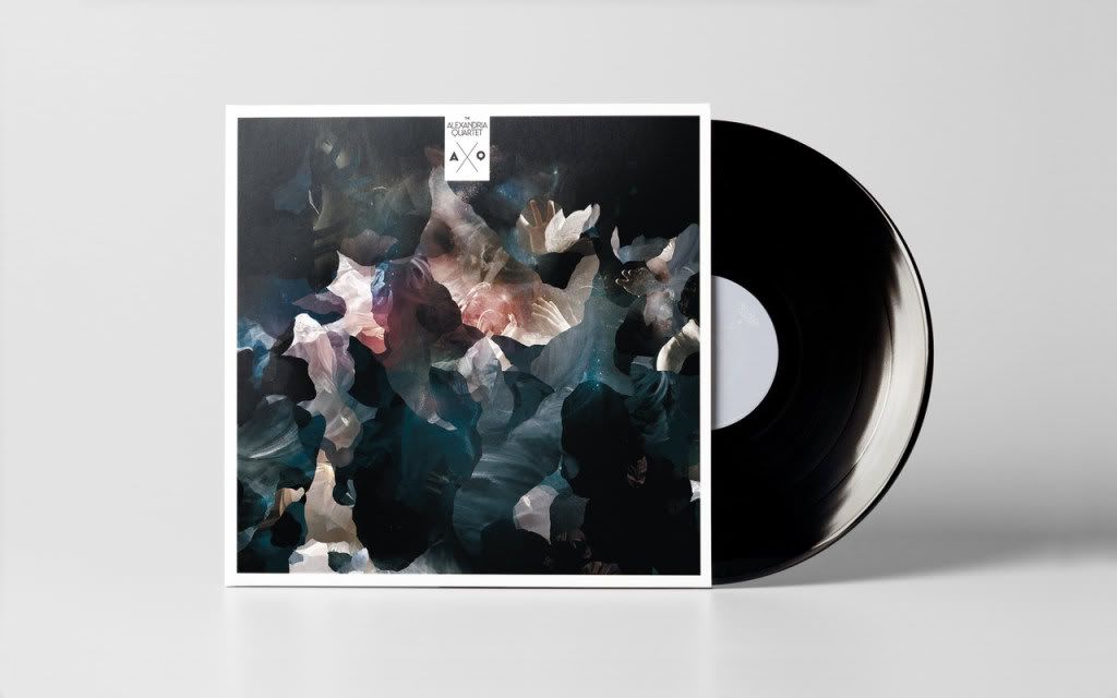
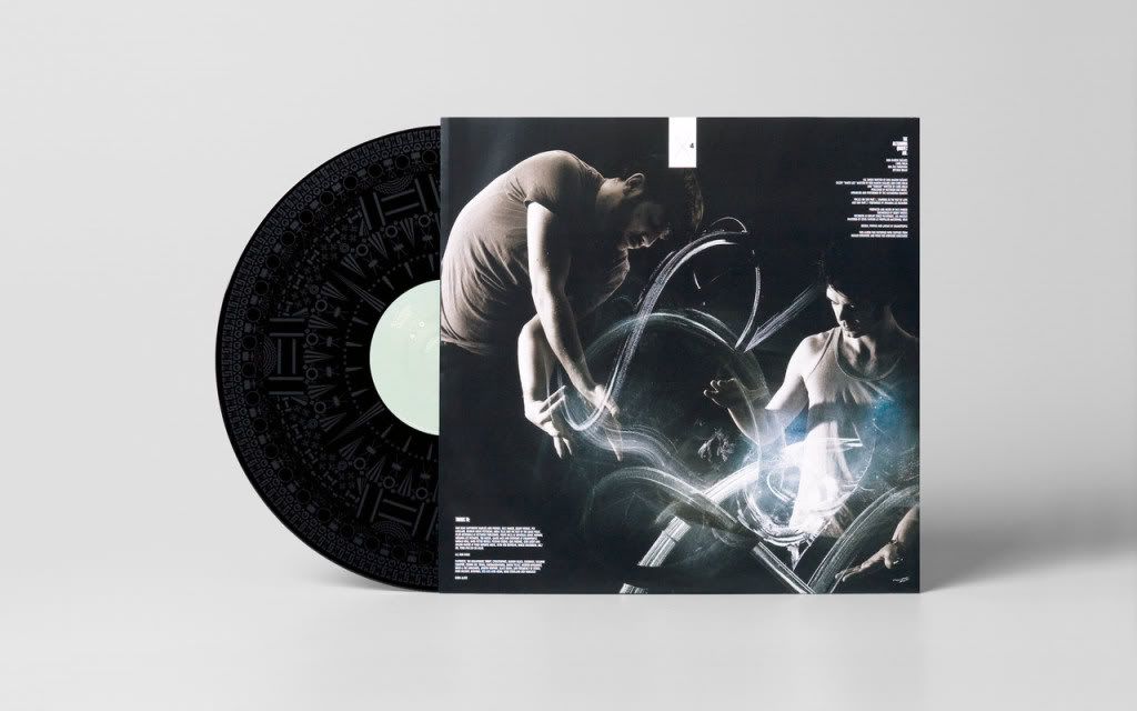
TAQ – Light Drawings
The Alexandria Quartet’s new material has taken on a darker edge, coloured by the dark, rainy clouds and the harshness of Norwegian winter. Grandpeople wanted a look that reflected this new musical direction, which led them to use a combination of illustration, handmade textures and photography, shooting the band in a dark studio setting.
http://www.septemberindustry.co.uk/grandpeople/


http://www.carldetorres.com/

